Every Layout Design
Published
Here we are, my first post on version 2 of the blog. Welcome! I'm not exactly sure how I'll be using this blog in the future, but one thing I really wanted was a space where I could copy and play around with designs from other websites (or even magazines). I'm a dev at my core but I wish I was a talented designer. To that end, I'm using this blog as a place to experiment with design and layout and, like art students of past, I'm copying the greats as a means to learn. I'm gon' kick things off with a beautiful design I've had my eye on for a while, which will probably be this site's default style when I'm not in the mood to create new stylesheets - Heydon Pickering and Simon Bell's Every Layout.
Their design looks deceptively simple - just black and white - it is gorgeous and executed flawlessly. If you've ever made a website using just the colours black and white, you'll realise how impressive this is.
Have a scroll through this page to get a feel for the design, or head over to the Every Layout site itself, to experience the real thing.
In this post, I break down the main elements of their design and show you how to achieve a similar result on your own website. The code I share is what's behind this page; the components are written in React (.tsx) and styled using CSS modules.
The table of contents #
A chunky border around a nav element with a list inside... and a gorgeous label top right. Simple and stunning. The unsung hero is all the white space to the right of the list / under the title. If we removed either the whitespace or the title, this element would look decidedly mediocre.
There's only a few elements to this component and the beauty is kinda in the simplicity of it all. Here's my take on their component (note that I've also included the variables.module.css file which is loaded into the main page itself):
import Link from "next/link";
import React from "react";

import styles from "./TableOfContents.module.css";

export interface TableOfContentsItem {
  id: string;
  text: string;
}

interface TableOfContentsProps {
  items: TableOfContentsItem[];
  title?: string;
}

const TableOfContents = (props: TableOfContentsProps): JSX.Element => {
  const { items, title = "Table of contents" } = props;
  return (
    <nav className={styles.root}>
      <span className={styles.title}>{title}</span>
      <ul className={styles.ul}>
        {items.map((item) => (
          <li className={styles.li} key={item.text}>
            <Link prefetch={false} href={`#${item.id}`} legacyBehavior>
              {item.text}
            </Link>
          </li>
        ))}
      </ul>
    </nav>
  );
};

export default TableOfContents;
Colors #
There's just four colours in the entire site. Well, technically, there's a fifth but it's only used for a warning message that's shown if you've switched JS off, so I'm not including it in the quota.
Even as I rebuilt their styles for this very webpage, I found it so hard not to add a pop of color here and there. It takes a lot of self-discipline to stick to such a simple palette but damn, the result is a really clean looking site.
#050505
#404040
gray
#e6e6e6
#fafafa
And here's how they are defined and used:
--color-dark: #050505;
--color-darkish: #404040;
--color-mid: grey;
--color-lightish: #e6e6e6;
--color-light: #fafafa;
background-color: var(--color-light);
color: var(--color-dark)
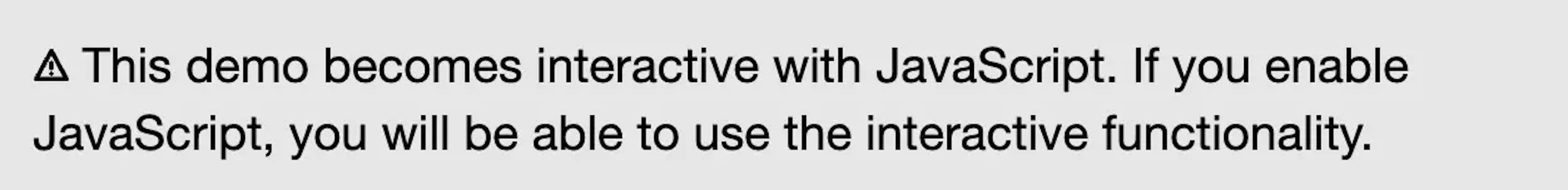
Basically, --color-dark is the (almost) black text (and the background colour for code blocks), --color-light is the (almost) white background (and font colour for code blocks). --color-darkish is used to highlight text in code blocks (however, I haven't implemented any syntax highlighting on this page). --color-mid is used as the focus colour for inputs and the like. --color-lightish only makes an appearance if you switch JS off, which displays the following message:

Borders #
Every Layout teaches you about CSS and the border has been used to great effect to illustrate the layout of HTML elements.
The designers weren't scared to use chunky borders to outline elements. In the absence of distracting colors, the bordered elements really sing.
Also of note is the border-radius of zero.
Whenever I've used borders, especially with a radius of zero, my designs look terrible. Here, this combination is a charm.
Typography #
--font-plain: Helvetica Neue,Helvetica,Arial,sans-serif;
--font-special: Barlow Condensed,Helvetica,sans-serif;
--font-mono: Menlo,Courier,Courier New,Andale Mono,monospace;
For headings, the site uses Barlow Condensed but for other fonts, Mac system fonts are used (falling back to more widely installed system fonts for PC and Linux users) - Helvetica Neue (pronounced: noy-uh, apparently) for general text and Menlo for code.
The authors also use a neat little trick to get the font size to scale up for larger screens:
font-size: calc(.333vw + 1em);Since all other font sizes are declared in rems, all the text will scale seamlessly as the viewport width changes.
Oh and one final thing worth mentioning - the 'measure'
The width of a line of text, in characters, is known as its measure. Choosing a reasonable measure is critical for the comfortable scanning of successive lines. The Elements Of Typographic Style considers any value between 45 and 75 reasonable.
In my opinion, this is one of the easiest improvements developers can make to the UX of their website. Once you are aware of the 'measure' you see it being used all around you - particularly in print media. How much easier is it to read a newspaper article compared to a Wikipedia article‽
Although the Every Layout site tells you to declare the measure in chs, I recommend that you use rems instead as otherwise the width will be context sensitive (for example, the base font size of a heading is different to a paragraph) and your elements won't line-up. In fact, if you peek into Every Dev's source code, you'll see that they also use rems for the measure and not chs. In this page, I use a measure of 40 rem
Spacing #
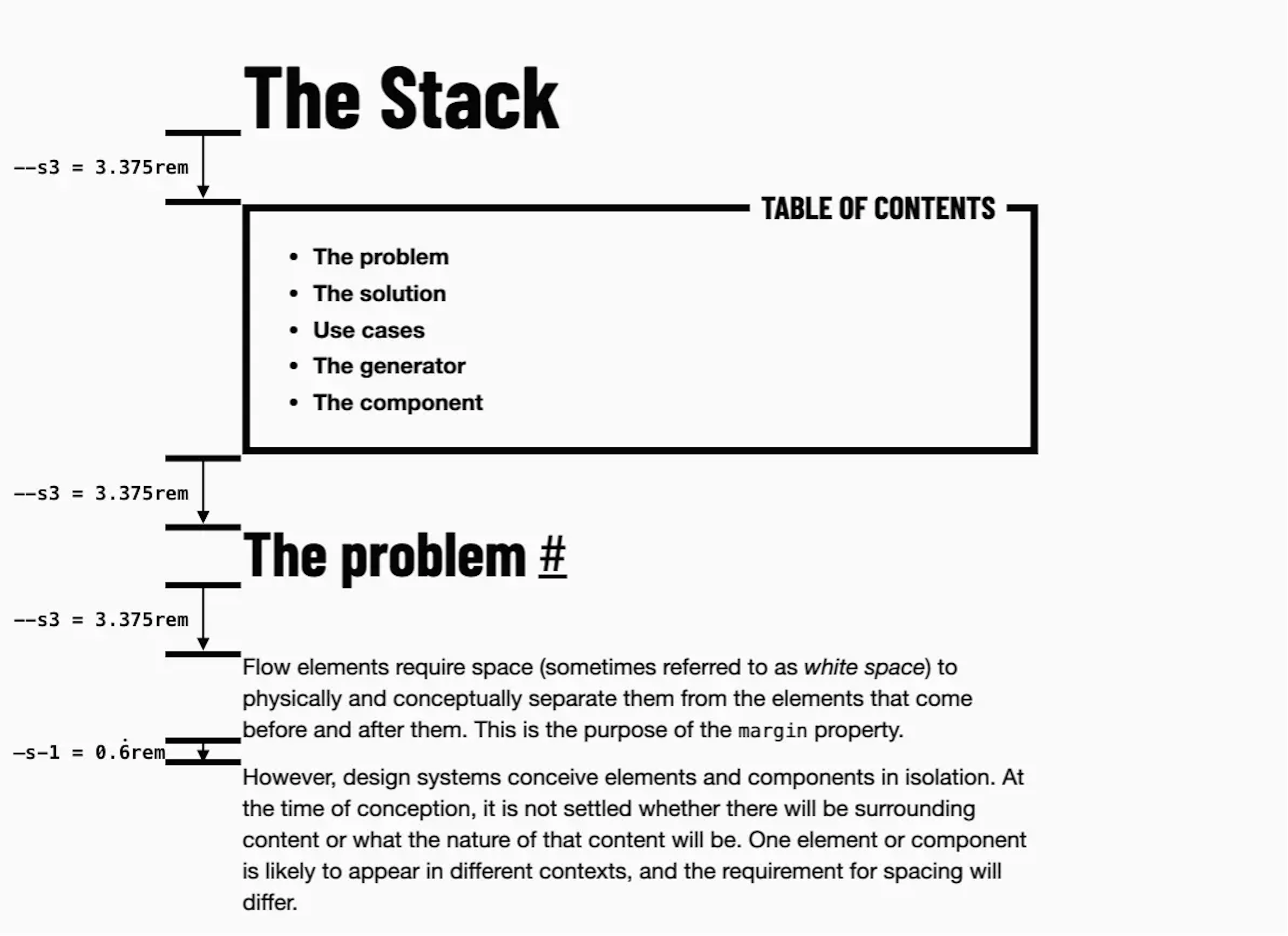
The first page I ever read on the Every Layout site was about The Stack' layout system - a way to add spacing around elements. It really changed the way I thought about laying out a page and I've used their method ever since.
The authors have defined a scale system (more on that later) and used it with their 'stack' method to space the elements on the page. Basically, each element has a 3.375 rem gap between itself and its preceding element. Consecutive p elements have a 0.666 rem gap between them.
.main > * + * {
    margin-top: var(--s3);
}
.main p + p {
    margin-top: var(--s-1);
}
Ultimately, this leads to a very pleasing layout which is also easy to maintain ✌️

Their 'Modular scale system' consists of 11 different rem values, all 1.5 X multiples of each other. Everything on the site is sized according to one of those spacing variables. So if you want to set a height for your nav bar or a width for an image, you'd choose one of these 11 values. It's a great way to have consistency on your site. Here's the relevant CSS:
.root {
    --ratio: 1.4;
    --s-5: calc(var(--s0)/var(--ratio)/var(--ratio)/var(--ratio)/var(--ratio)/var(--ratio));
    --s-4: calc(var(--s0)/var(--ratio)/var(--ratio)/var(--ratio)/var(--ratio));
    --s-3: calc(var(--s0)/var(--ratio)/var(--ratio)/var(--ratio));
    --s-2: calc(var(--s0)/var(--ratio)/var(--ratio));
    --s-1: calc(var(--s0)/var(--ratio));
    --s0: 1rem;
    --s1: calc(var(--s0)*var(--ratio));
    --s2: calc(var(--s0)*var(--ratio)*var(--ratio));
    --s3: calc(var(--s0)*var(--ratio)*var(--ratio)*var(--ratio));
    --s4: calc(var(--s0)*var(--ratio)*var(--ratio)*var(--ratio)*var(--ratio));
    --s5: calc(var(--s0)*var(--ratio)*var(--ratio)*var(--ratio)*var(--ratio)*var(--ratio));
}
Easter Egg #
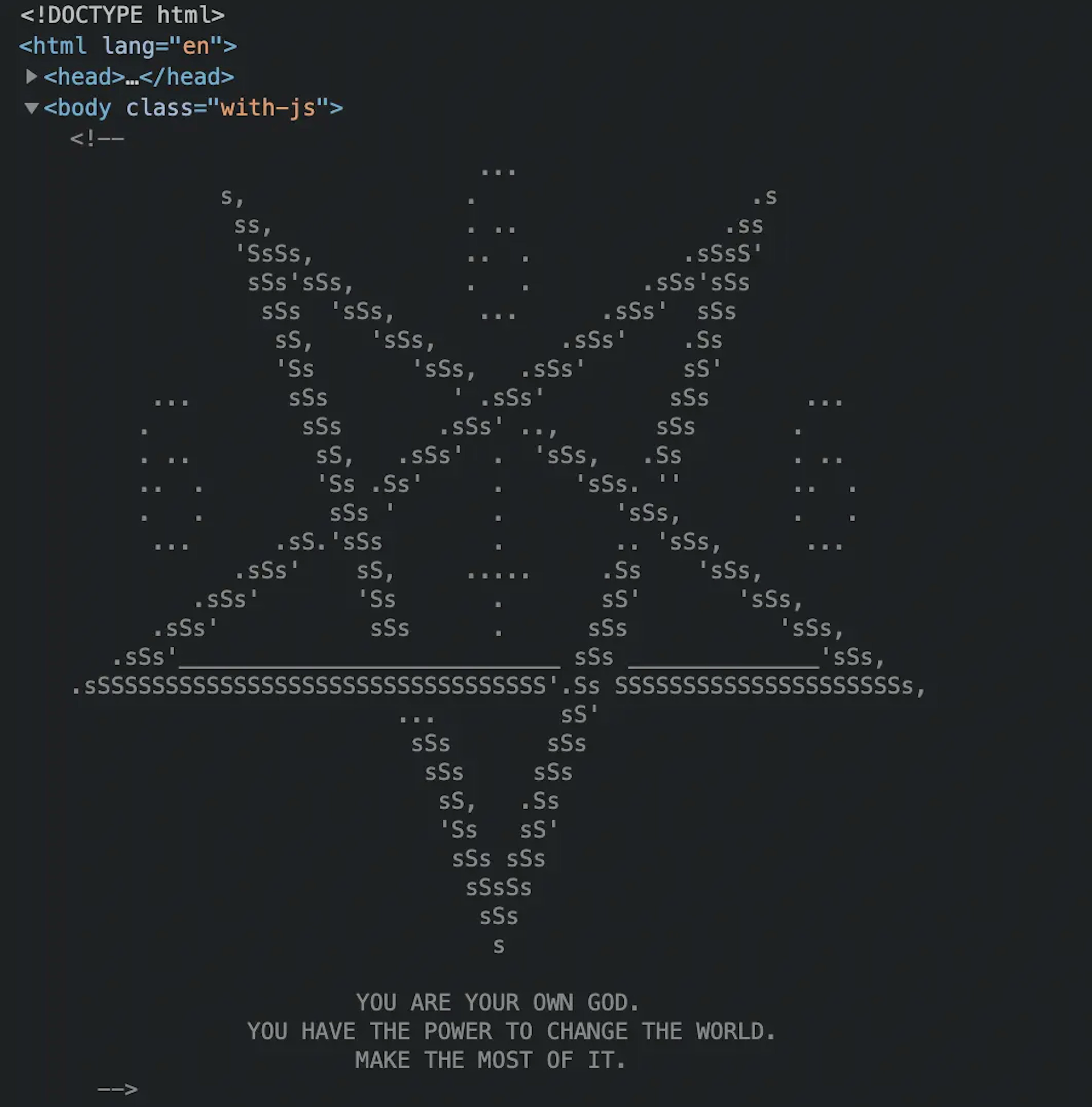
If you open up your dev tools and view the source code of the Every Dev website, there is a little Easter egg waiting for you - 666 and an upside down crucifix inside a pentagram. I really need to think of some cool ASCI art to put in my source code!

So there we are, a teardown of the Every Layout site. I really enjoyed putting this page together and it really made me appreciate the decisions the authors took when making this clean and beautiful website.