React Native Notes – 003
Published
Button layout patterns in iOS
While building Wobble Time I've put buttons in the navigation bar of my app; sometimes there will be just just one button which leads to the question – should it be on the left or the right? Sometimes there will be two buttons in the navigation bar, which leads to the question – should the primary button be on the left or the right?
I haven't been able to find a satisfactory answer in Apple's Human Interface Guidelines regarding button placement in the navigation bar. As developers and designers we have the ability to use different coloured text in these buttons, different weight text and we can also position them on the left or right of the navigation bar.
I've gone through some of Apple's own apps to try and figure out a pattern, take a look at these screenshots:
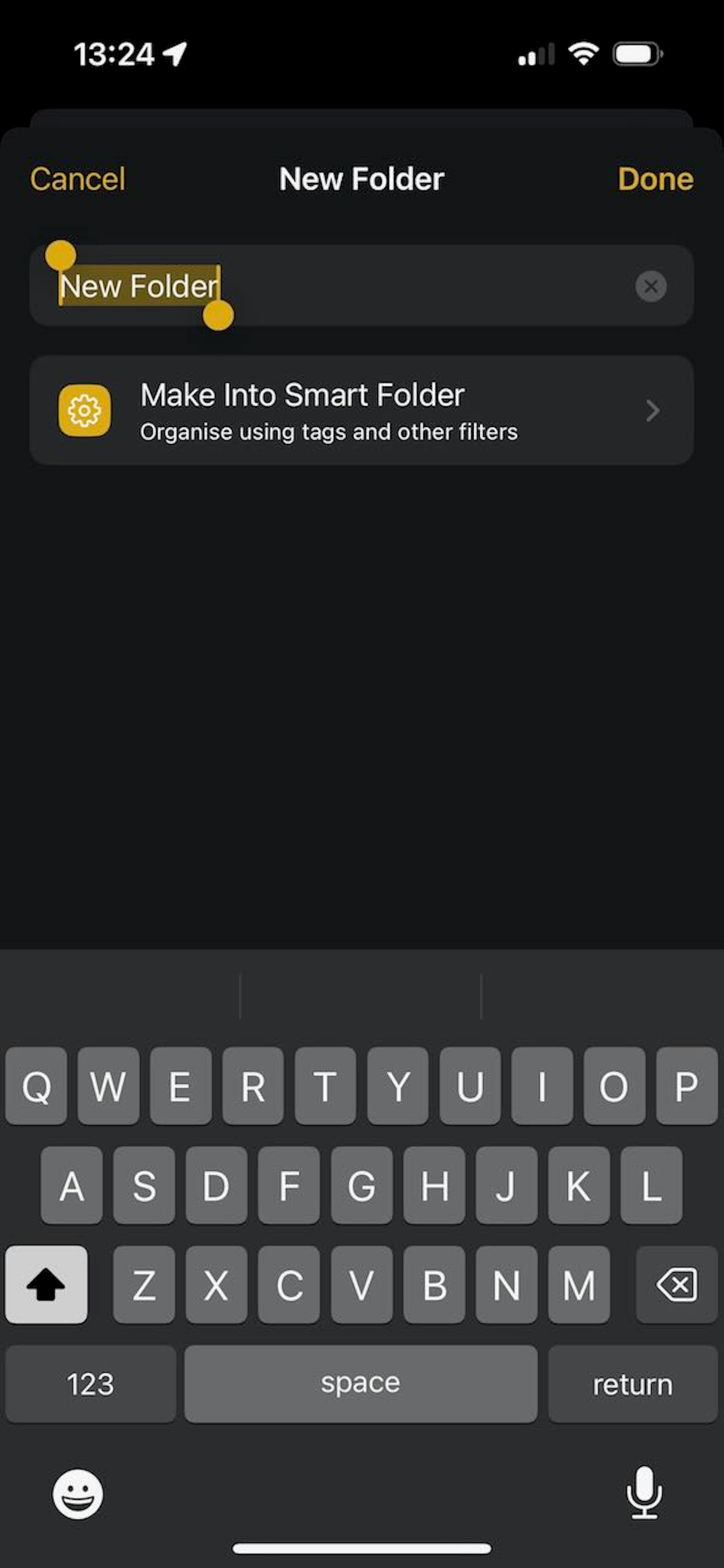
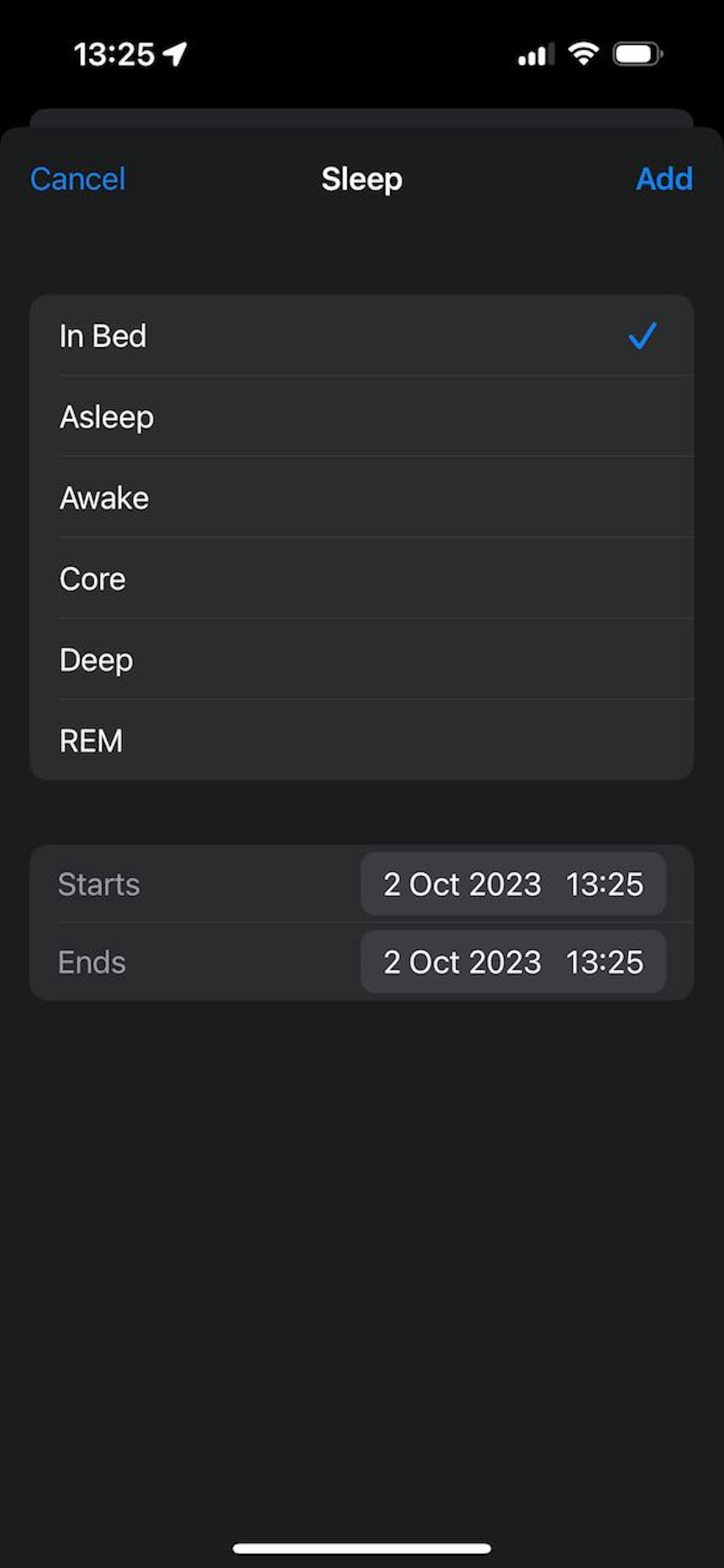
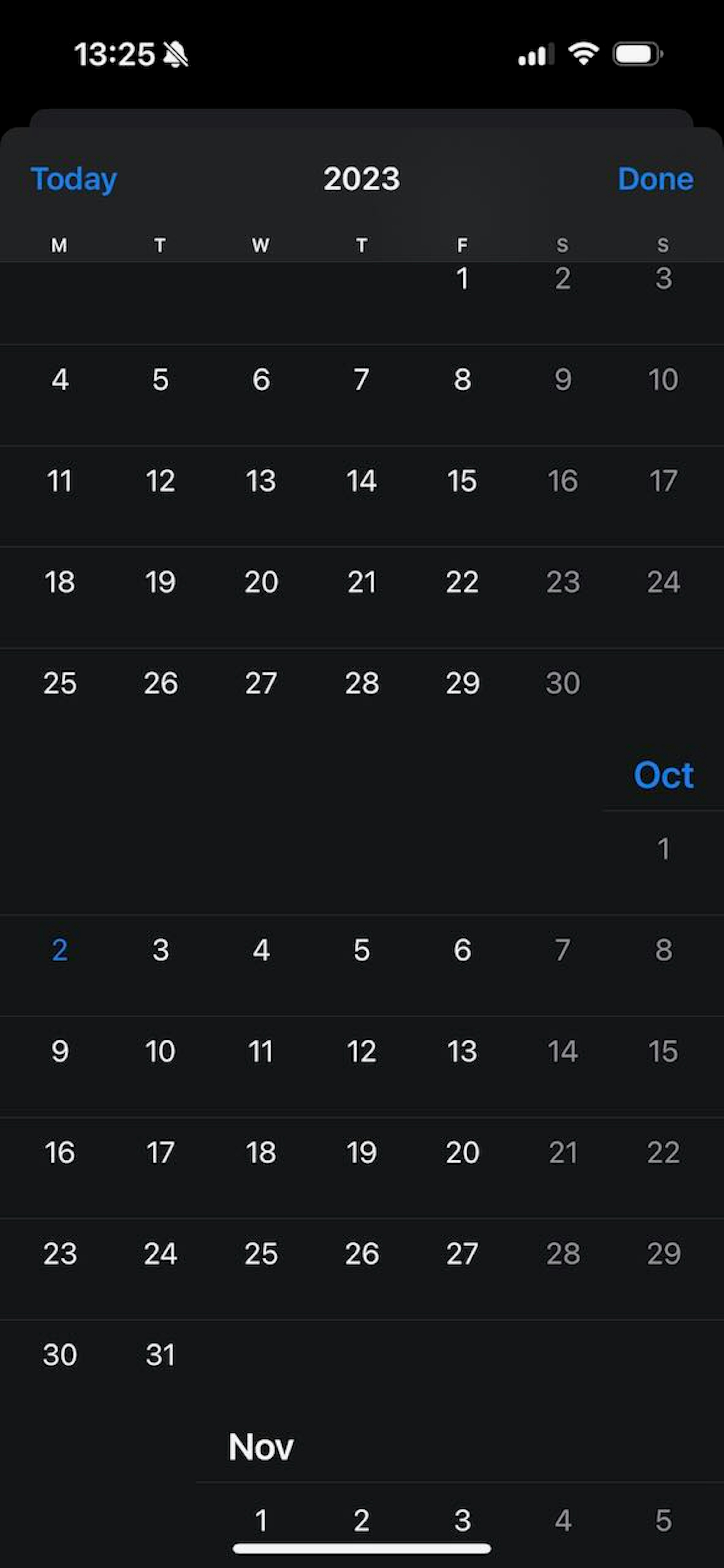
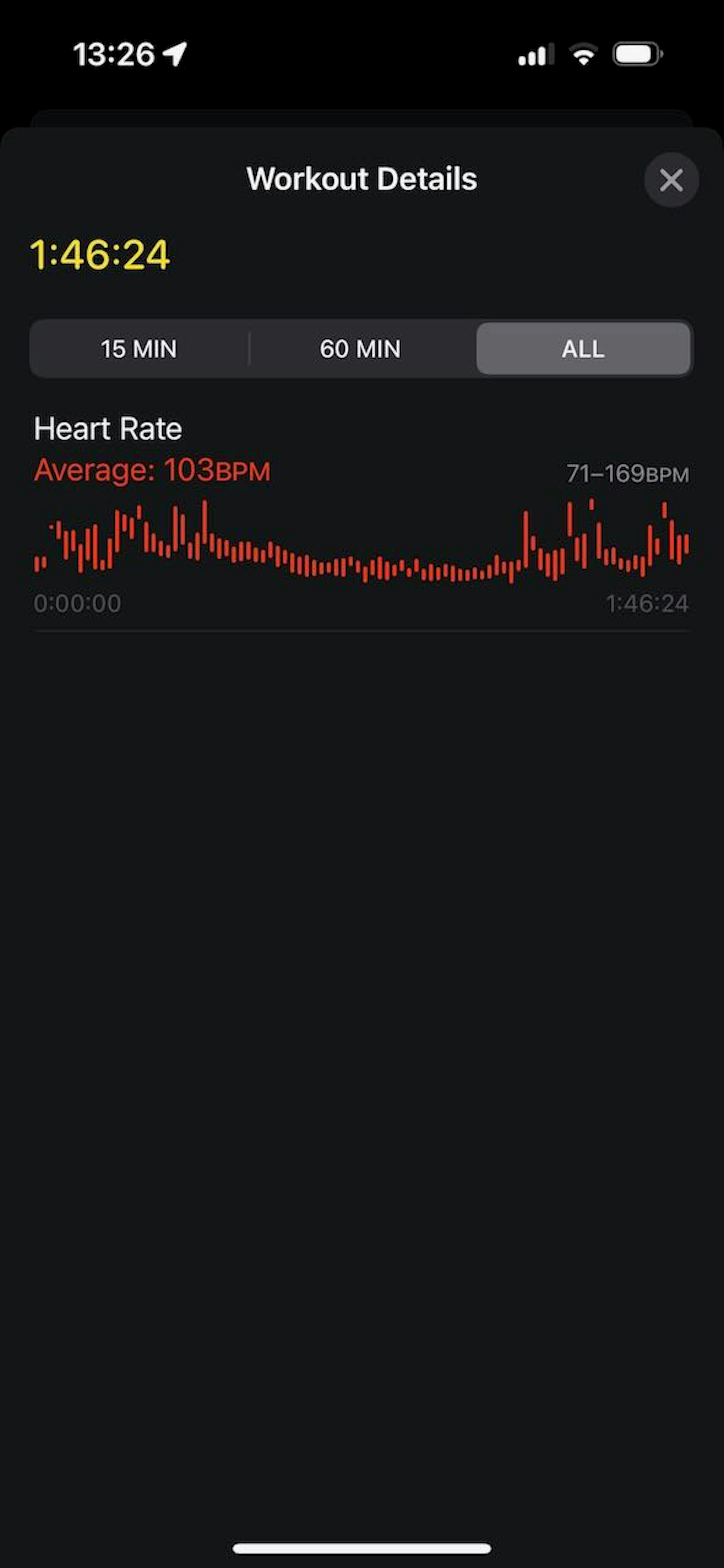
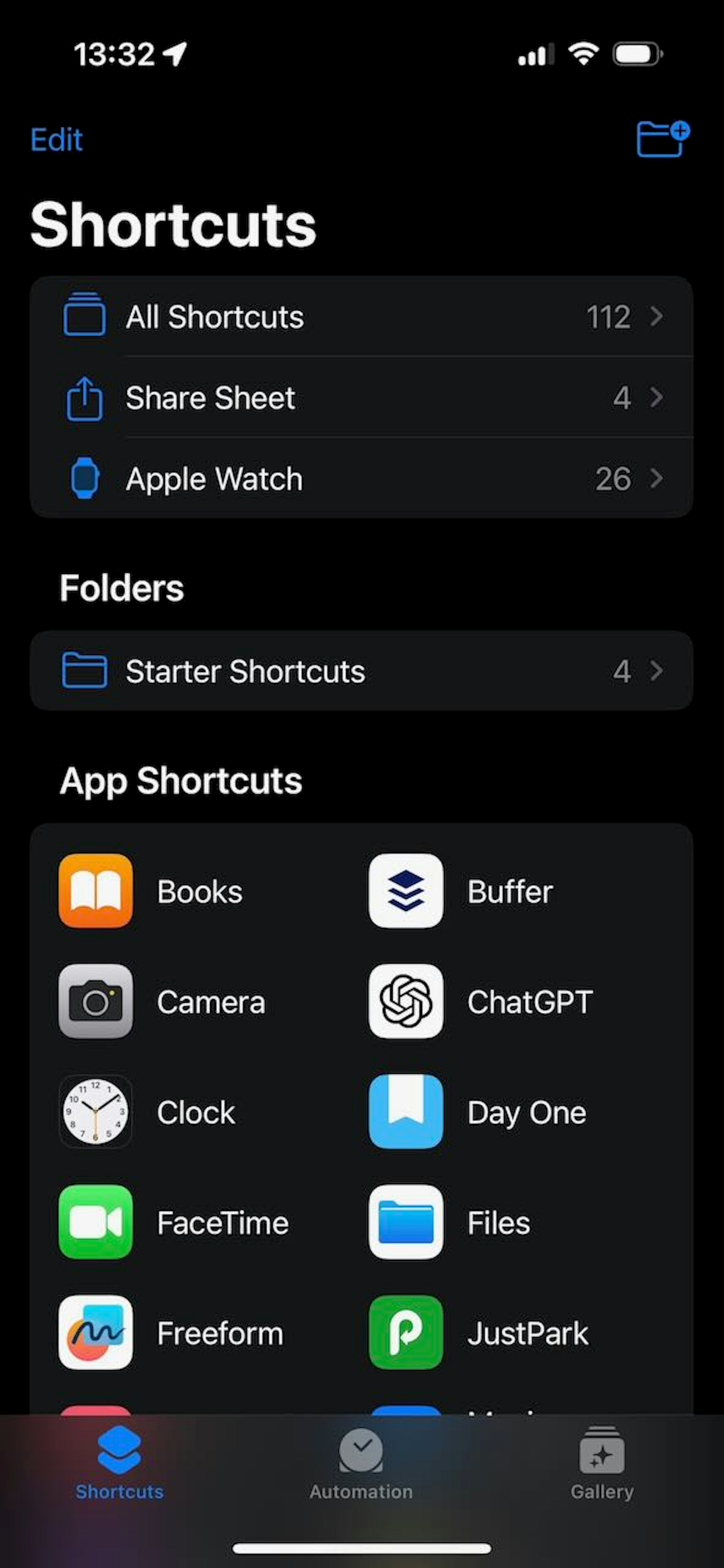
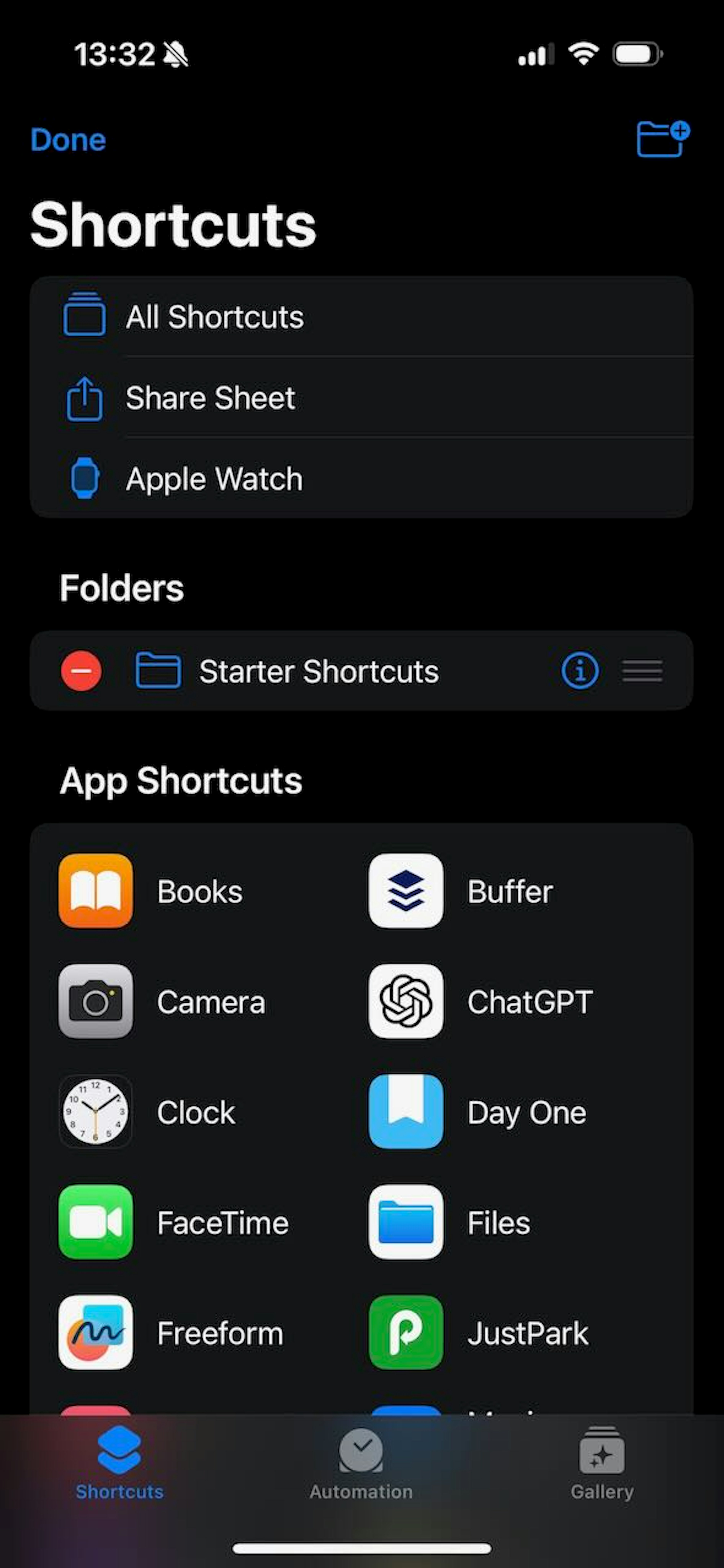
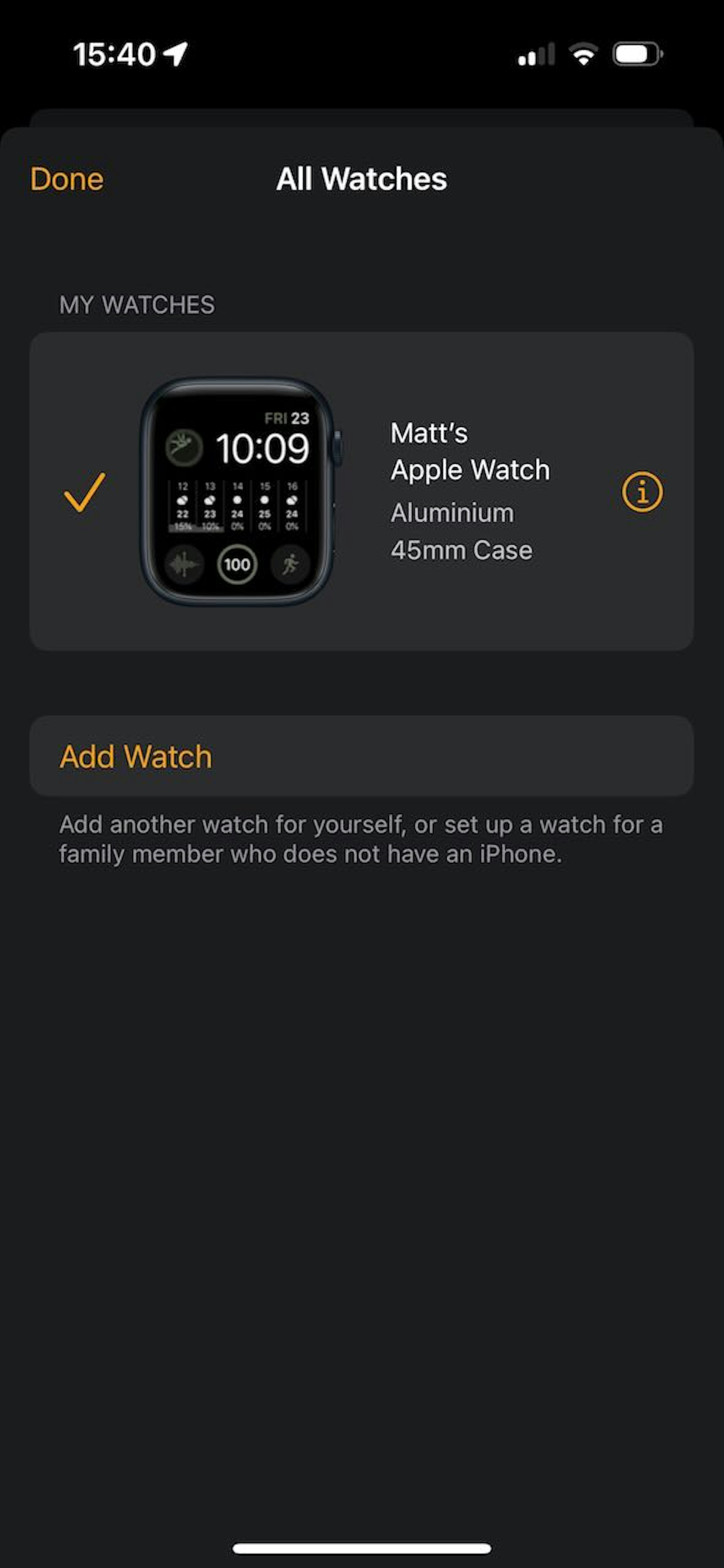
These 7 screen shots show that there is variability in how Apple is styling navigation bar buttons, but some loose patterns to follow when creating iOS navigation bar buttons are:
- Use 'plain' style buttons
- You can use text or icons for this
- Use "Title Style" text
- Use the app's accent colour for the button
- Some minor operations may use secondary and tertiary label colours (or red for delete-like actions)
- If there are two buttons, only have one primary one
- The primary button should use a bold font weight
- The primary button is generally on the right
- but put it on the left if that makes for a better UX!
"Done" is quite a common action button to implement in the navigation bar. Looking at Apple's own apps, you can see that they don't consistently place this action on the same side. For me, it makes most sense to put "Done" on the left when it's effect is similar to a back button, otherwise put it on the right.
Implementation with React Native
When it comes to putting this into practise, the obvious choice is using a Button component however, the React
Native Button scales its text – seemingly with no bounds – as the user increases their font size preferences.
Unfortunately, there is no maxFontSizeMultiplier prop (or similar) that we can apply to cap the size of the button.
Additionally, there is no way to alter the font weight used for the text. This is an issue because the Human Interface
Guidelines
state that a bold weight is used for a primary button.
So the Button really fails us on two fronts.
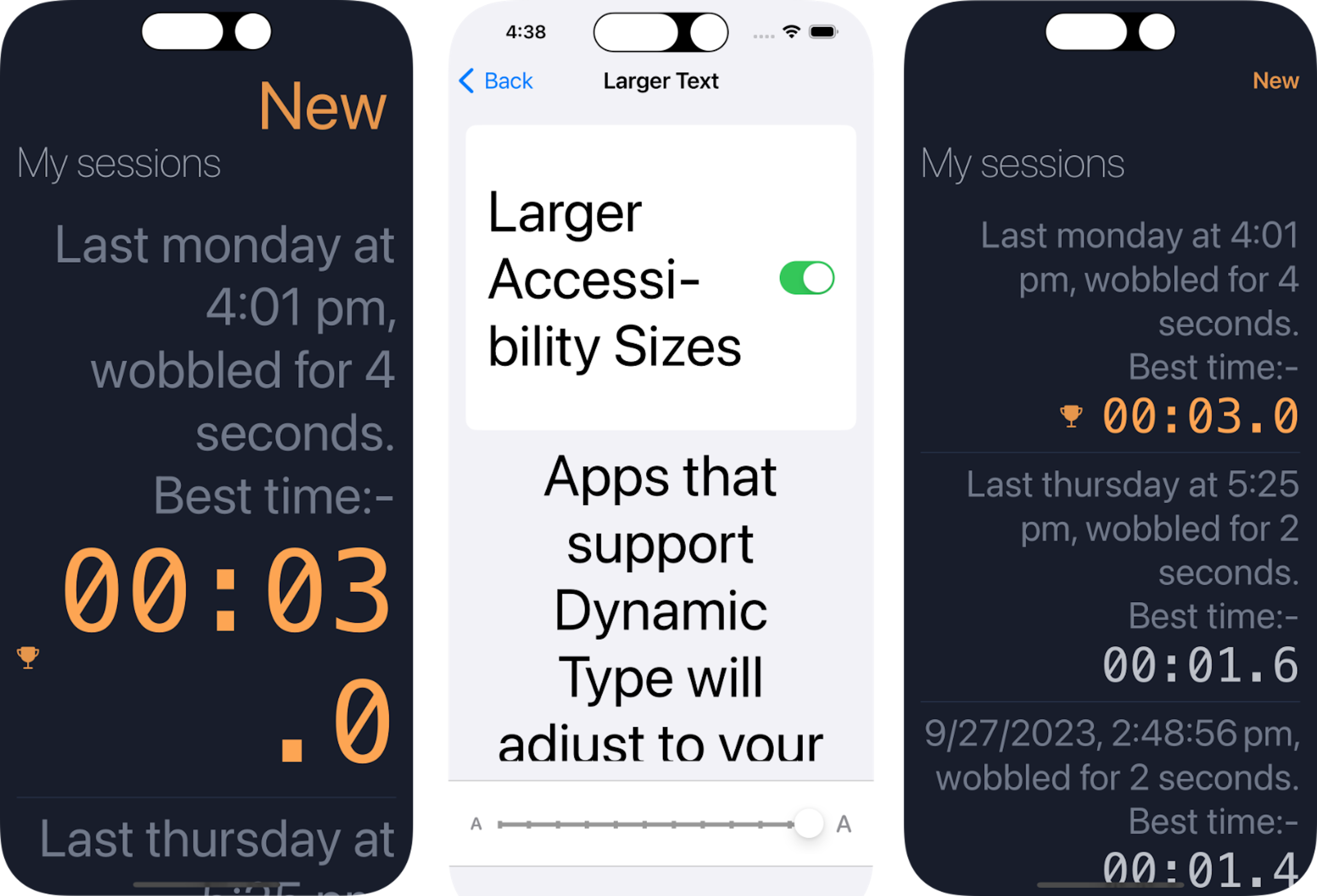
Fig 10 shows how the React Native Button component reacts when the user has upped their preferred type size; it's far
too large for the navigation bar, especially when compared to "Back" button in the Settings app which has been capped at
an upper limit.
Also note how the "lap time" (in orange) has scaled from an already large font size to something that is obscene and,
frankly, ruins the app. On the right of Fig 10 is my updated app; the "New" button is capped, matching what Apple do;
text within the screen is also capped. Note that you don't have to scale all the text in your app by the same amount,
the less important stuff doesn't need as much (if any) scaling.
Prioritize important content when responding to text-size changes. Not all content is equally important. When someone chooses a larger text size, they typically want to make the content they care about easier to read; they don’t always want to increase the size of every word on the screen. For example, when people choose a large accessibility text size, Mail displays the subject and body of the message in the large size, but leaves less important text — such as the date and the sender — in a smaller size. Source: Human Interaction Guidelines.
My customised button is a Pressable component wrapping some Text. This works nicely in the navigation bar and also
throughout the app:
export function AppButton(props: AppButtonProps) {
  const {
    fontWeight,
    color = rawColors.primary600,
    title,
    onPress,
    style = { color: "inherit" }, // noop to make TS happy that this is a style (casting to a ViewStyle doesn't work)
    ...rest
  } = props;

  // testing shows that this value, combined with the font size of 18, is the largest font size
  // that Apple use in their own buttons when the a11y dynamic font size is maxed-out.  const maxFontSizeMultiplier = 1.2;

  return (
    <Pressable
      accessibilityRole="button"
      onPress={onPress}
      hitSlop={60}
      {...rest}
      style={(state) => {
        return {
          opacity: state.pressed ? 0.5 : 1,
          ...style,
        };
      }}
    >
      <Text
        style={[appButtonStyles.text, { color, fontWeight }]}
        maxFontSizeMultiplier={maxFontSizeMultiplier}
        // Apple buttons never drop below this size. Unfortunately, this prop doesn't appear to be respected, or I misunderstand what it does.
        minimumFontScale={18}
      >
        {title}
      </Text>
    </Pressable>
  );
}

export function AppHeaderButtonPrimary(props: AppButtonProps) {
  return (
    <AppButton {...props} color={rawColors.primary600} fontWeight={"600"} />
  );
}

const appButtonStyles = StyleSheet.create({
  text: {
    // this is the font size that Apple use in their own buttons
    fontSize: 18,
  },
});